4 Instagram Story Mistakes You’re Making (And How to Fix Them)
In comparison to permanent Instagram posts, Stories are a much more candid medium for interacting with your audience. This is one of the reasons why Stories are a powerful marketing tool, but the casual, raw nature of this channel doesn’t mean that whatever you choose to do on it is right. On the contrary, Stories, just like every aspect of social media, come with their own hacks, methods for maximizing their potential, and tactics that simply work or don’t work with the audience.
It takes some time to entirely immerse yourself in this medium, and you’re bound to be doing some things wrong. Don’t worry, we’ve all been there! Here are the 4 most common Insta Story mistakes you might be guilty of and how you can fix them.

You’re inconsistent
Maintaining a consistent image and tone of voice is a crucial aspect of building your brand identity and building a trusting relationship with your audience. But, marketers often forget this part when it comes to Stories because it’s so easy to cross the fine line between being candid and being completely random on ephemeral channels.
If there’s more than one person running your brand account on Instagram, it’s even more likely you’ll make this mistake. That’s why it’s important to agree on some details beforehand to ensure that your Stories, however informal and off-the-cuff, convey a certain look and feel that’s representative of your brand. These include:
- The general tone of voice of your captions and videos
- Which hashtags you’ll use most often
- How often will you be using stickers and emojis in your Story and which ones are your favourite?
- Deciding on templates you use and whether they’ll present your brand’s colour palette
- Choosing your custom fonts (Instagram offers a very limited range but you can use the Storrito editor to use custom fonts in your Story)
Experimenting is great and necessary with Instagram marketing, but make sure that your entire presence doesn’t appear random and ultimately voiceless. You can prepare Stories in a team and schedule them for auto posting to ensure that the brand voice is aligned with each one and that they are also posted consistently.
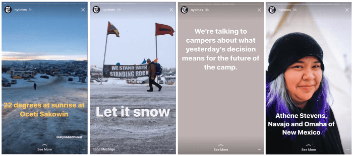
You’re not mixing media
If you’ve posted ten snippets of still images today, or cut up a video into Story slides stacked one after the other, don’t be surprised to see your audience trailing off one by one with each new slide.
It’s difficult enough to catch the audience’s attention, but it gets harder to maintain your grasp on it as your Stories progress. Variety helps a lot. Use all kinds of media in your Story sequence – video, images, text-only, boomerang…throw in some live video too! That way, you’ll always be using the medium that resounds best with the message you’re trying to convey, helping you get your point across in a smooth and resounding way. It also gives your Stories a narrative break and keeps the monotony at bay. Your audience will really appreciate this and the variety will keep them hooked through the entire sequence. And don’t worry – if you’re not too keen on fiddling with all this on your phone, Storrito is here to help you prepare Stories on a desktop PC.
 mediablog.com
You’re placing clickable stickers awkwardly
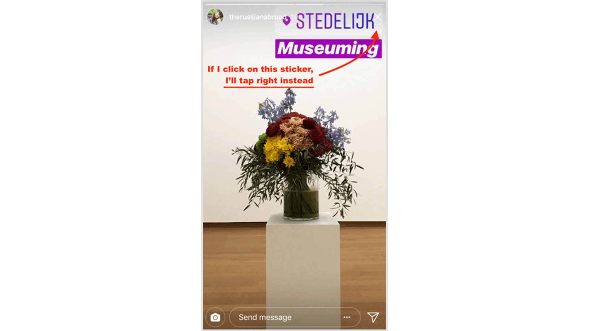
This is one mistake I’m seeing all too often on Instagram, and it really makes for a frustrating user experience. When you use clickable stickers in your Story – account mentions (usertags), hashtags, and geotags – make sure you place them somewhere on the screen where clicking on them won’t take the user to an unintended action. This is usually the middle of the screen, closer to the bottom but away from the “message” feature.
If you place them too close to the right side of the screen (as so many people often do), when users tap on them they will likely tap forward accidentally or exit your Story sequence. Make sure your stickers are easily visible and clickable.

You’re not providing an interactive experience
This is a cardinal mistake, but fortunately, it’s easily fixable – you just need a little awareness and practice. Stories work best if you provide the viewer with an interactive experience, and the key is to always think in terms “How can I immerse the user in this experience or involve them in it?”
For example, if you’re trying to showcase a product, don’t post a still image and that’s it. Show them the packaging, film yourself unboxing it, build up the anticipation, show yourself using it afterward. Communicate directly – tell them how you’re feeling about it and what are your favourite parts. Throw in some polls and swipe meters to ask them for their opinion. Whenever you’re about to post a still image, give it some thought as to how you can make the Story a more three-dimensional experience for the viewer.
There are many more Insta Story mistakes out there, but we felt that these were the ones that needed your urgent attention. Reflect on how you’ve been using Stories and if you see yourself making any of these mistakes, take our advice for fixing them. The fix is actually very simple but you’ll find it’s also very beneficial to your Insta Story efforts.
Written by Angelina Harper.
Resources:
